Brand Guidelines
This guide defines the visual language, design style, and principles that shape a clear and consistent brand experience, no matter the team or area of expertise.
At its core, Wick & Pour is about creative expression and social connection. This guide lays out the essential design standards that bring our brand to life, from our color system and typography to the visual language that turns first-timers into regulars and solo visitors into new friends.
From designing for digital platforms to printed materials, these guidelines ensure every touchpoint reflects the creative spirit at the heart of Wick & Pour.
Contents
01 Brand Strategy
02 Personality
03 Logo
04 Color
05 Typography
06 Art Direction
01 Brand Strategy
Some moments are made to be shared — a night out, a new skill, a scent that's entirely yours. Wick & Pour is where creativity meets good company, and ordinary evenings become something worth talking about. This is more than candle-making. It's the experience you didn't know you needed.
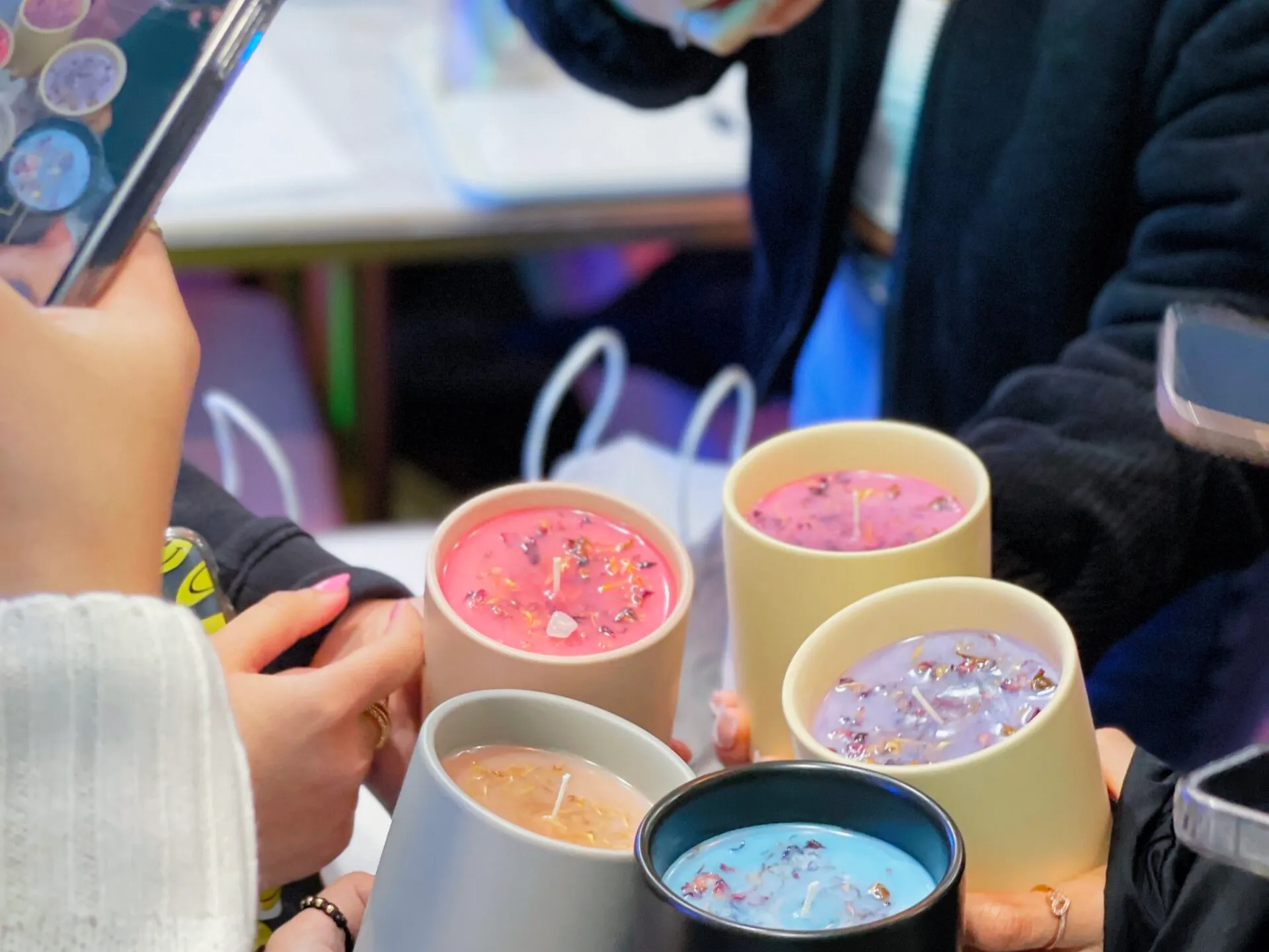
Born from a love of creativity and human connection, Wick & Pour was founded on a simple idea: making something with your own hands — surrounded by good people and great scents — is an experience worth showing up for. We believe the best nights out leave you with more than a memory. They leave you with something you made yourself.
At Wick & Pour, we don't just teach candle-making — we create the kind of moments people talk about, come back for, and can't wait to share. Because when the atmosphere is right and the creativity is flowing, something special happens every time.
02 Personality
Wick & Pour's voice brings our brand to life through every word we write and every experience we create. The way we communicate has the power to turn a curious first-timer into a regular, and a night out into a cherished memory. Through warm, intentional language we make creativity feel accessible, exciting, and entirely yours. Our voice is lively, elevated, and always inviting — because every interaction should feel like the beginning of something good.
Tone & Voice
Our Vision: why we exist
To create a space where creativity is social, and every guest leaves with experiences so good, they can't stop talking about them.
Our Mission: what we do
Craft hands-on candle-making experiences that bring people together, spark creativity, and turn an ordinary night into something unforgettable.
Our Promise: how we show up
Every time you walk through our doors, you'll leave with something handcrafted, a story worth telling, and a reason to come back.
Applications
Website
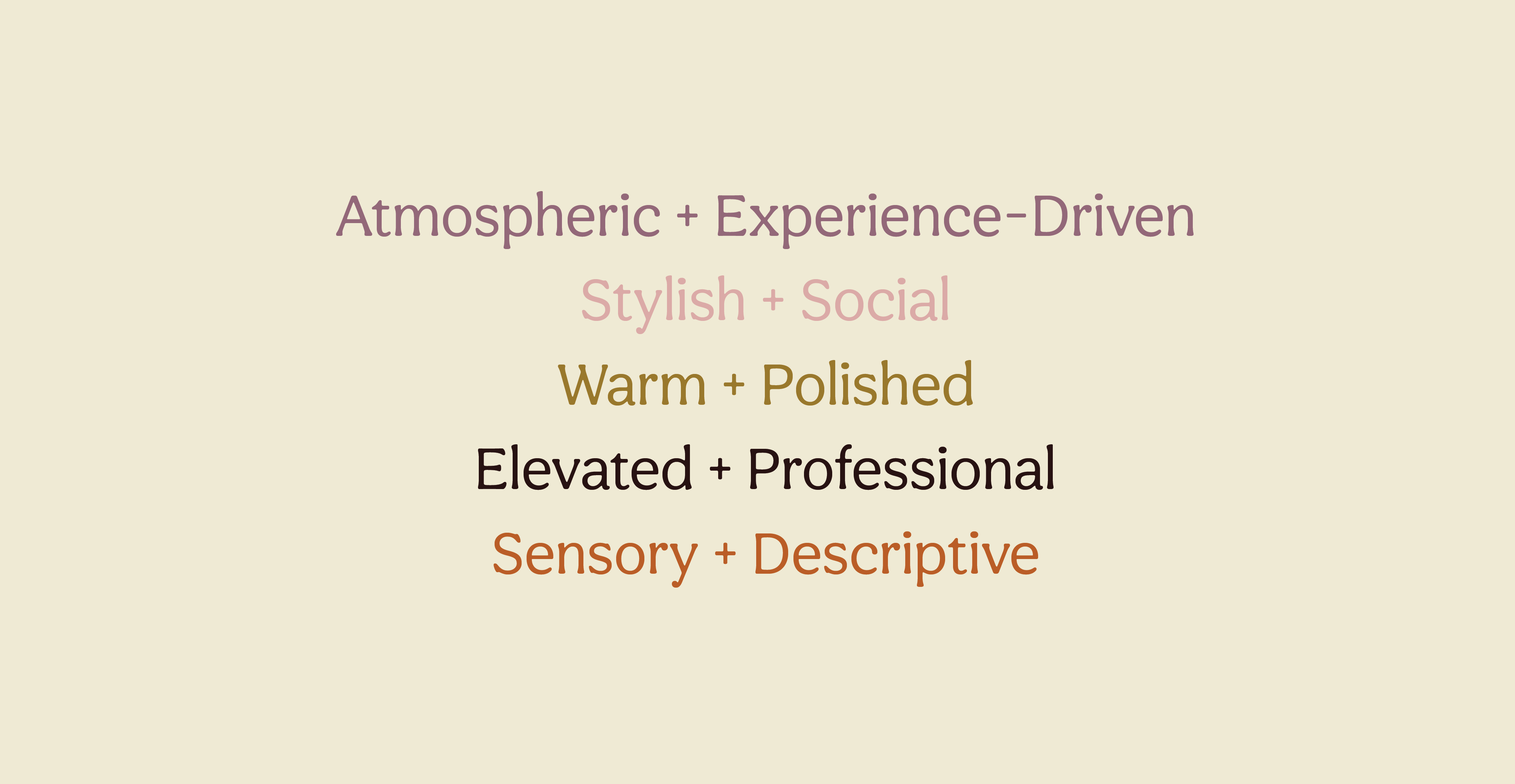
Atmospheric + Experience-DrivenExample: An evening of fragrance blending, candle pouring, and conversation in the heart of NYC. Come create something uniquely yours.
Stylish + SocialExample: Candles. Cocktails. Good company. Your Thursday plans just got interesting.
Warm + PolishedExample: We're saving a seat at the pouring table. Join us this weekend for an experience built around creativity, connection, and great scents.
Corporate Materials
Elevated + ProfessionalExample: An interactive team experience designed to spark creativity, strengthen connection, and leave a lasting impression.
Product Page
Sensory + DescriptiveExample: Notes of cedarwood, amber, and soft vanilla create a warm, layered fragrance that lingers long after the flame is out.
Example: "Book a Candle-Making Experience"
Website
Discover NYC's candle-pouring experience for nights worth remembering.
Your next night out smells amazing already.
Looking for something different this weekend? Join us for an evening of fragrance blending, candle pouring, and conversation.
Corporate Materials
A creative team experience that combines hands-on participation with a welcoming, professionally hosted environment.
Product Page
The same fragrance expertise from our studio experience, now available to enjoy at home.
03 Logo
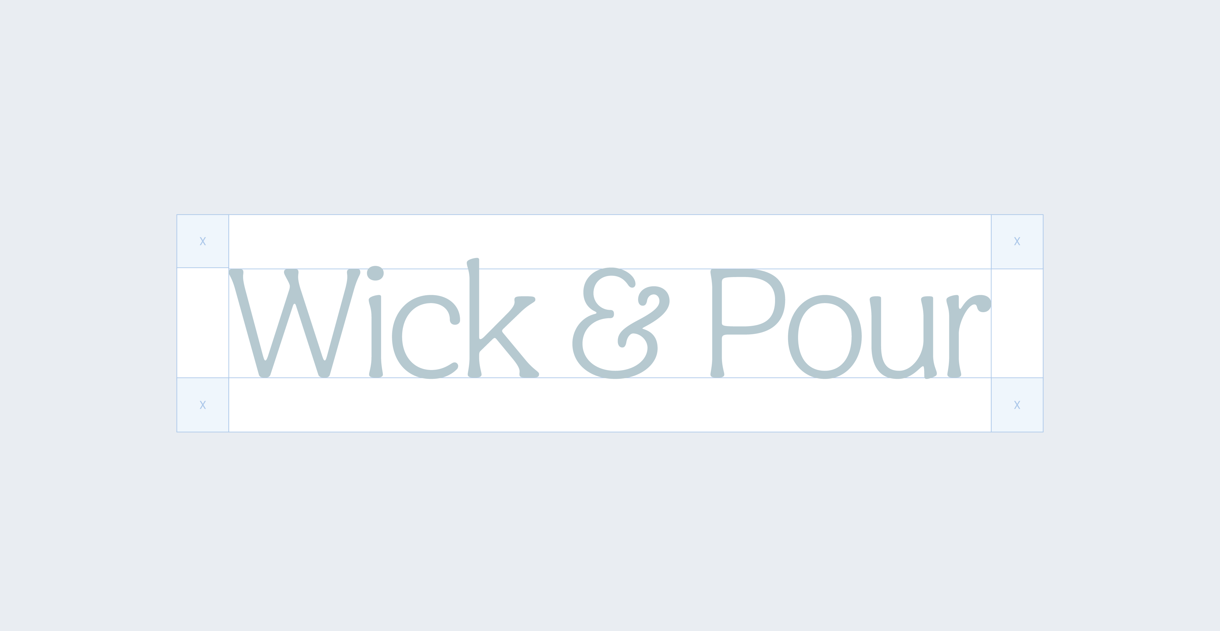
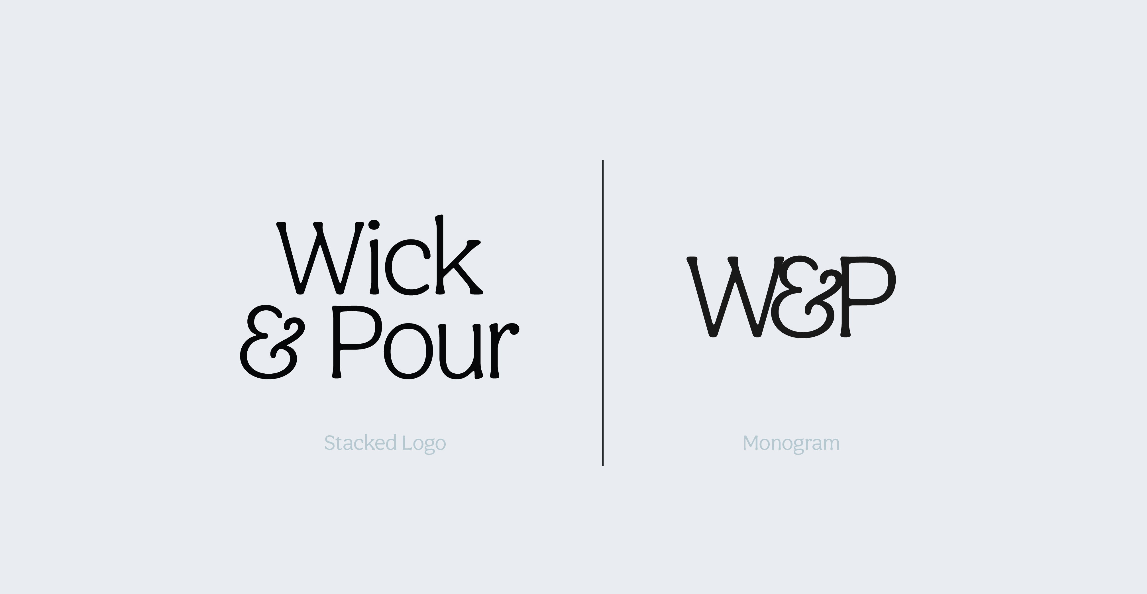
The Wick & Pour logo is bold, warm, and unmistakably social — designed to feel as inviting as the experience itself. The strong typographic lockup conveys confidence and creativity, while the playful ampersand adds personality and signals connection — a reminder that everything we do is better together.
The color system is intentional and alive. Each scent family carries its own color, giving the brand a visual language that's as rich and varied as the experiences we offer. Bold, saturated tones reflect our energy and approachability, while the warm neutral base keeps everything grounded and sophisticated.
More than just a mark, the Wick & Pour logo is a signal — to first-timers, to regulars, and to anyone scrolling past — that something creative, social, and worth experiencing is happening here.
Primary Lockup
Clearspace
Secondary Lockups
Incorrect Usage
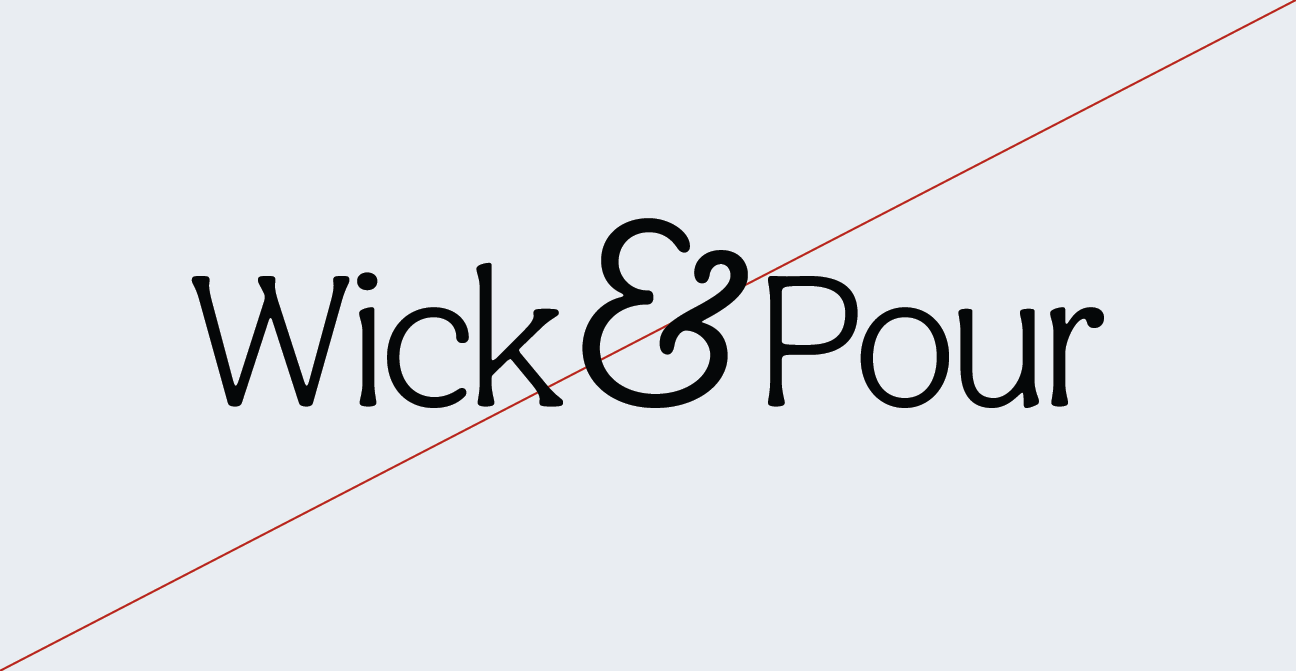

Do not resize the mark
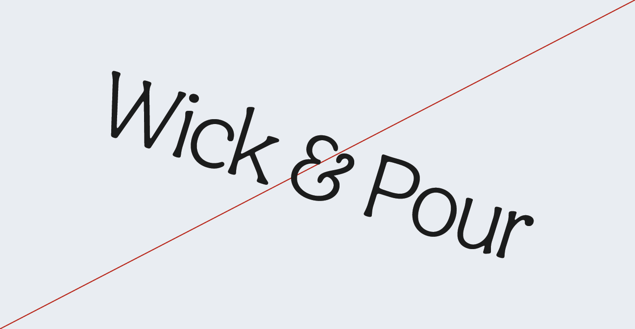
Do not rotate the logo
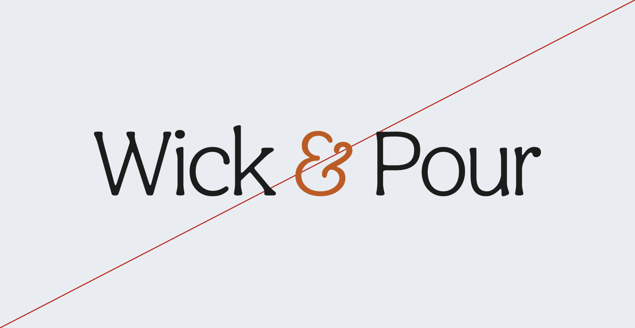
Do not change the color of the mark alone
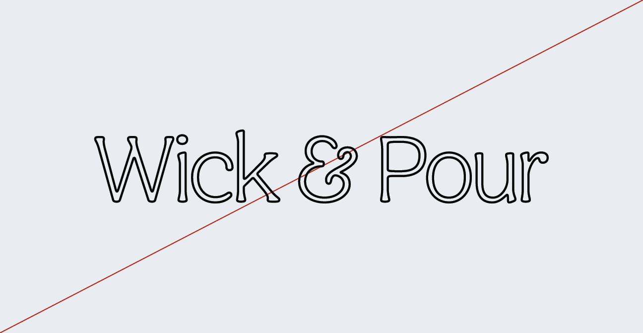
Do not outline the logo
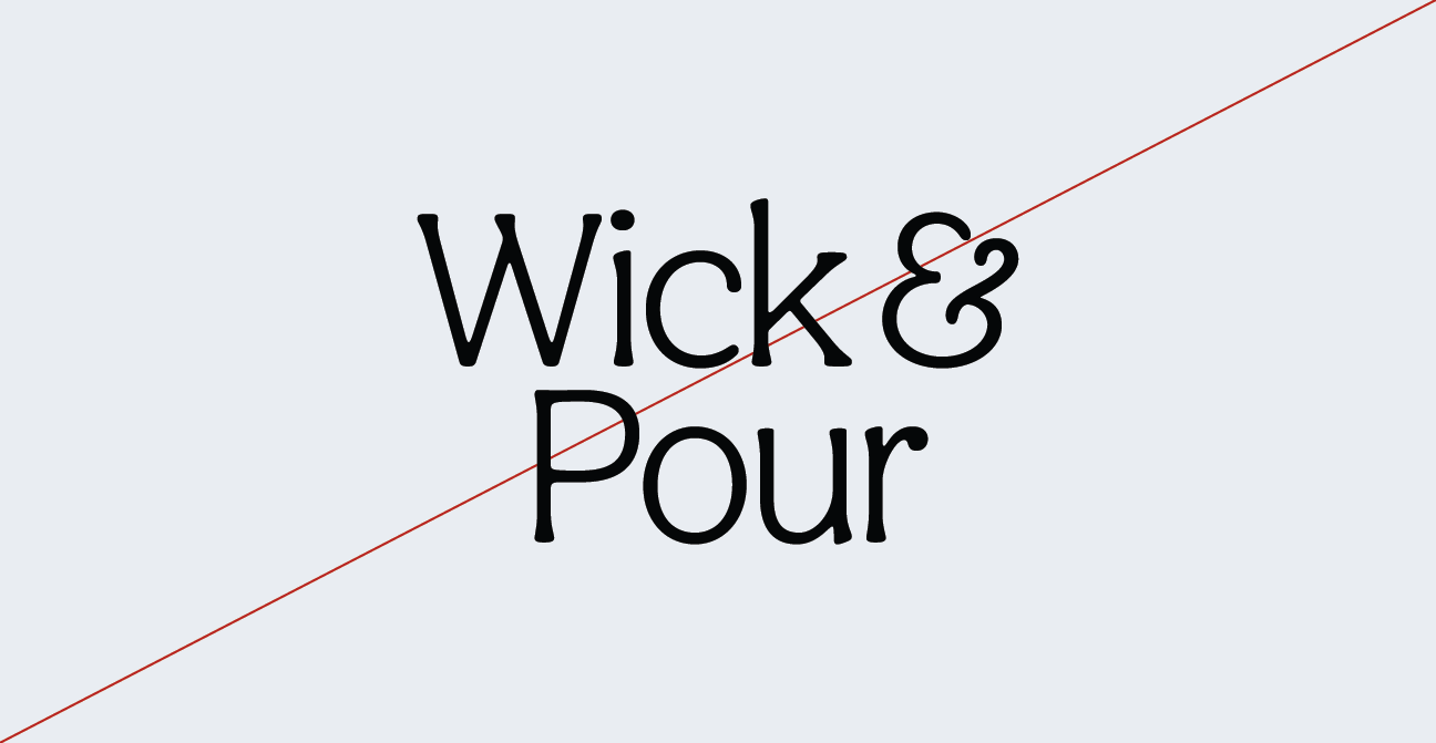
Do not change the lockup
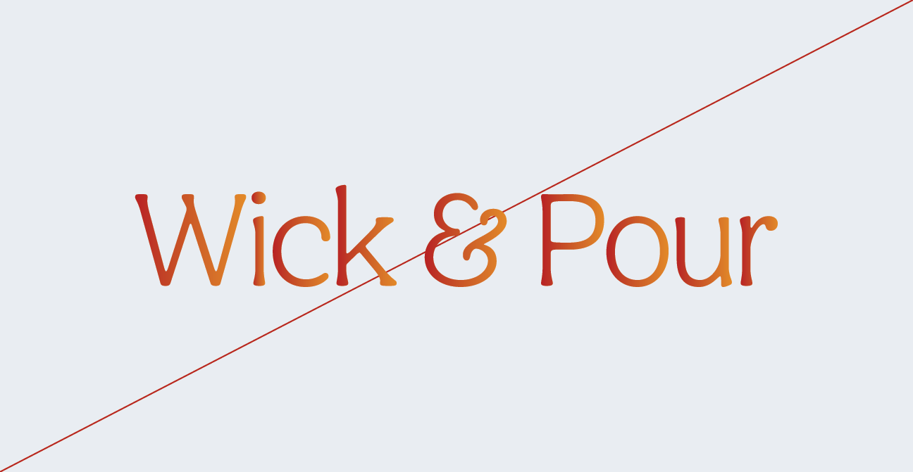
Do not add gradients in the logo
04 Color
Wick & Pour's color palette is designed to evoke creativity, warmth, and the kind of energy that makes people want to be part of something. Every color in our system has a purpose — rooted in the scent families at the heart of our experience and expressive enough to carry the brand across every touchpoint.
Together, these colors create a visual identity that's lively, modern, and instantly recognizable — ensuring that Wick & Pour is always seen for what it truly is: a creative social experience worth showing up for.
Neutral Palette
Charcoal
Hex: #1c1c1c
Soy
Hex: #fef5e6
Unscented
Hex: #ede8d5
Color Palette
Spark
Hex: #b95b27
Melt
Hex: #94793a
Smoke
Hex: #261414
Lavender
Hex: #8c6978
Blush
Hex: #d3aba8
05 Typography
Wick & Pour's typography balances personality and polish — a modern type system that feels as creative and welcoming as the experience itself, while staying elevated enough to grow with the brand.
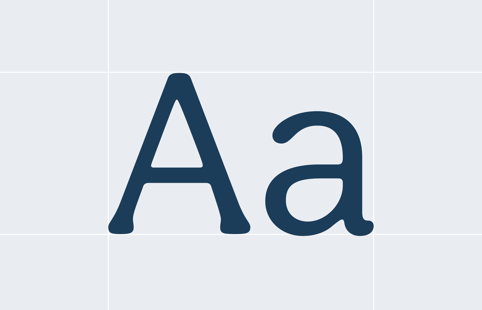
Aesthet Nova leads with elegance — a refined, editorial serif that balances classic sophistication with a modern sensibility. It brings a sense of quiet luxury and intentionality to every headline and brand moment.
Pitaloka plays a supporting role with personality — a warm, handcrafted script that adds an organic, human touch. Where the primary font leads with structure, Pitaloka leans in with charm, bringing a sense of artisanal craft and approachability to labels, accents, and moments that deserve a little extra warmth.
Instrument Sans is a clean, contemporary sans-serif that keeps everything readable, grounded, and effortlessly modern. It never competes for attention, but it holds the whole system together, giving body copy and supporting text the clarity and confidence the brand needs to communicate at every scale.
Together, this three-font system tells a complete story — Aesthet Nova sets the tone with editorial elegance, Pitaloka adds the handcrafted warmth that makes the brand feel personal, and Instrument Sans grounds it all in clean, modern readability. The result is a typographic voice that feels intentional without being precious, artisanal without being rustic, and refined enough to carry Wick & Pour from the studio shelf to the pages of a design magazine.
Primary Typeface
Aesthet Nova Regular
Secondary Typeface
Pitaloka Regular
Body Copy
Instrument Sans Regular
06 Art Direction
Wick & Pour's photography style reinforces what the brand is really about — creativity, connection, and the kind of atmosphere that makes people wish they were there. Every image should feel like an invitation.

The Experience in Action
Hands in wax, scents being blended, candles being poured. Close, warm, and tactile — these images put the viewer inside the moment and make the process feel irresistible.
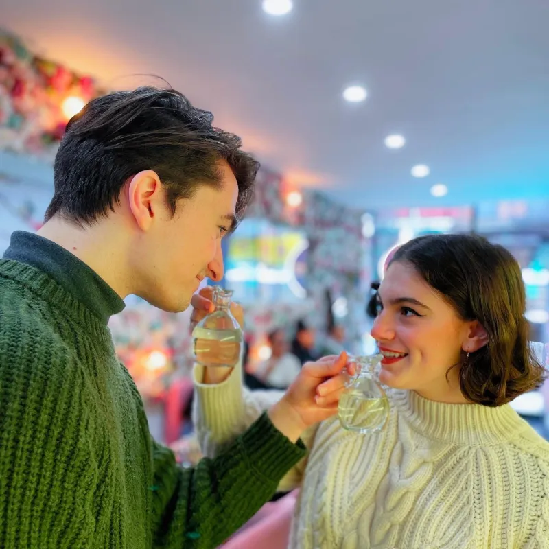
People & Connection
Guests laughing, toasting, creating together. Candid and unposed, these shots capture the social energy that sets Wick & Pour apart — stylish without being staged.
The Finished Product
Beautiful candles, clean labels, glowing flames. Elevated and sensory, these images do the work of a product page and an Instagram post at the same time.

Atmosphere & Ambiance
The studio, the glow, the details. Moody, warm, and cinematic — these establish the world of Wick & Pour and make anyone scrolling stop and think I need to be there.